Acacia (Golden Wattle Yellow)
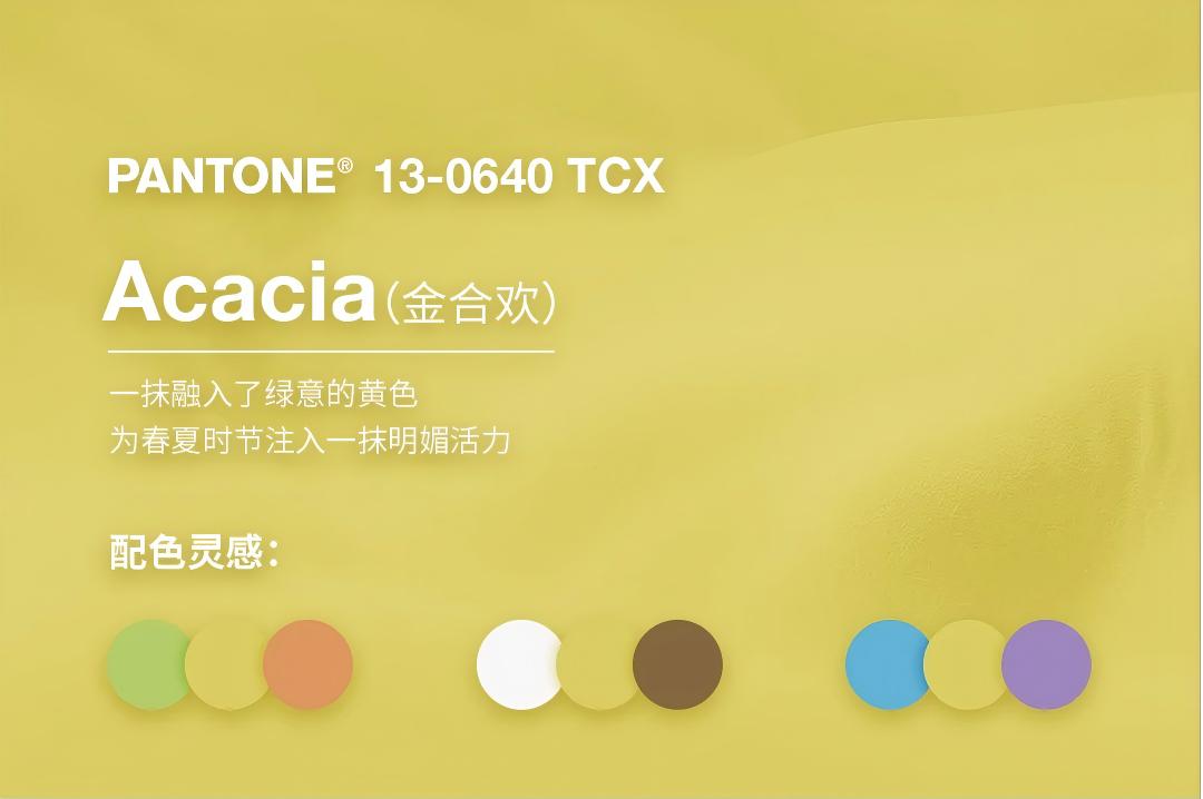
PANTONE® 13-0640 TCXA yellow infused with green undertones, it injects bright vitality into spring and summer—like the first ray of spring sunshine, bringing joy and inspiring a longing for nature.
According to experts from the Pantone Color Institute, designers at the 2026 SS NYFW boldly showcased personal style, using it as a solid defense against the impact of artificial intelligence and the growing trend of homogeneity. This season’s color palette breaks conventions, reinterpreting color application freely by skillfully contrasting warm, familiar tones with vibrant, bold shades and neutral bases.
“ The 2026 SS NYFW collections are a passionate celebration of self-expression and individualism, bringing us unprecedented inspiration for color matching.”— Leatrice Eiseman, Executive Director of the Pantone Color Institute
The 2026 SS color trends continue to reflect the desire for authenticity, originality, and a unique dressing style. Bold yet balanced color combinations fully embody the joy of dressing—blending cross-seasonal neutrals with calm minimalist tones to create unrestrained, fresh looks.
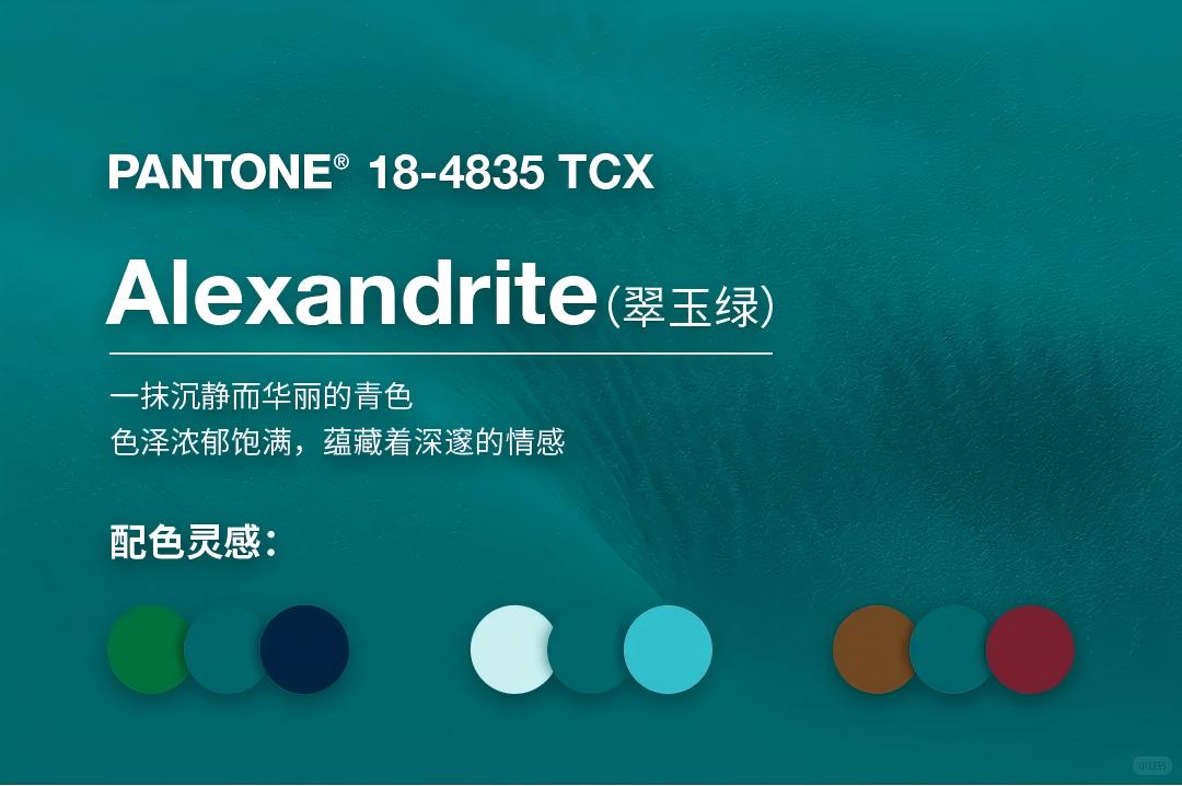
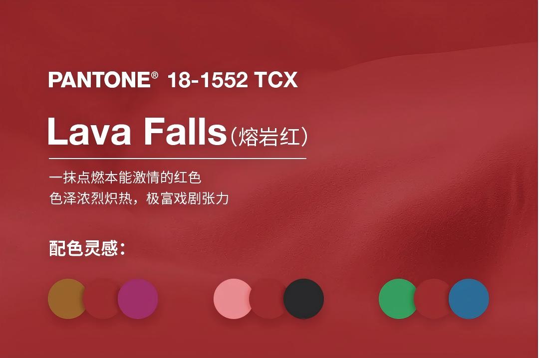
From the quiet luster of Alexandrite (a rich teal) to the dramatic intensity of Lava Falls (a fiery red); from the light, ethereal White Onyx to the balancing strength of Sage Green—this collision of maximalist and minimalist colors heralds innovative silhouette designs, unconventional matching methods, and distinctive self-expression, fully showcasing the diverse facets of human nature.
Colors connect with our senses in profound ways: they trigger a chain of emotions and subconsciously build a bridge between our visual perception and emotional awareness. Fresh, inspiring, and vibrant hues carry powerful energy—awakening these emotions, adding essential elements, and creating feelings of happiness and vitality.
Furthermore, PANTONE’s seasonal color trend reports (for both SS and FW) serve as a global benchmark for color trends, providing forward-looking color guidance for product design, spatial decoration, and fashion styling across industries.
In addition, the report introduces 6 new core cross-seasonal neutrals that serve as the foundation of timeless style:
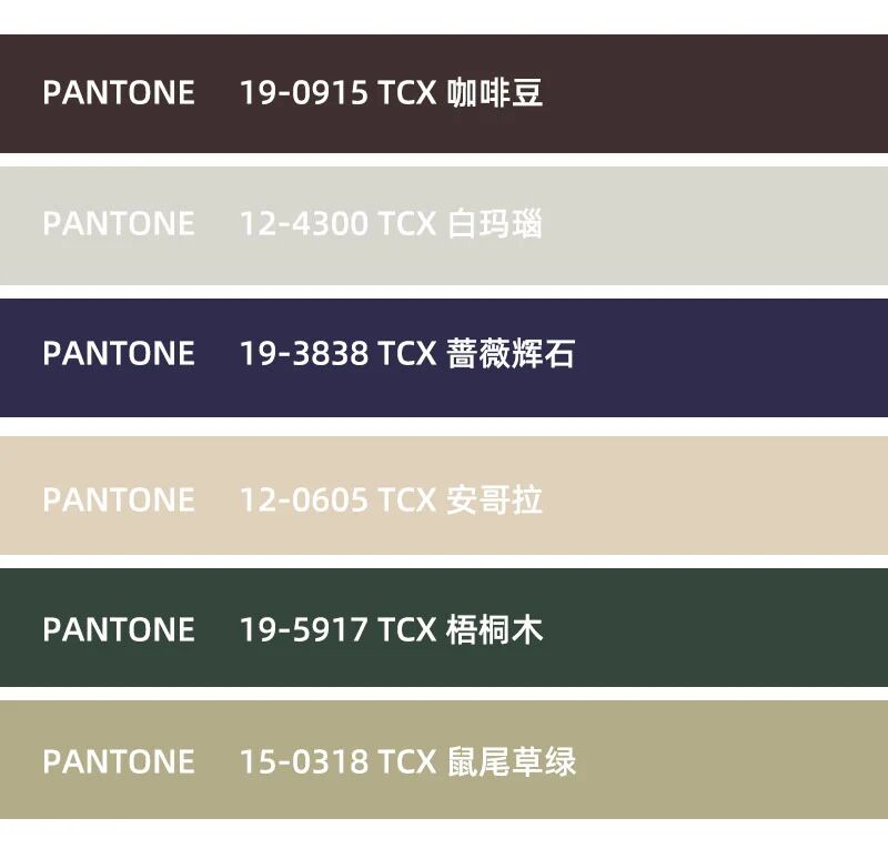
PANTONE 19-0915 TCX (Coffee Bean): A deep brown reminiscent of dark-roasted coffee, with notes of smoke, chocolate, and nuts.
PANTONE 12-4300 TCX (White Onyx): A translucent grayish-white with a soft, ethereal luster.
PANTONE 19-3838 TCX (Rhodonite): A reliable blue tone that conveys confidence and composure.
PANTONE 12-0605 TCX (Angora): A soft beige that evokes the silky, fluffy texture of angora wool.
PANTONE 19-5917 TCX (Sycamore): A deep forest green rooted in pure earth, creating an atmosphere of resilience and elegance.
PANTONE 15-0318 TCX (Sage Green): A soft green that brings a sense of balance and relaxation.
For jewelry, packaging is never a "supporting role"—it is the "first spokesperson" of its value.
With 20 years of experience in jewelry packaging, we at Annaigee have always believed: Exceptional jewelry packaging is the triple resonance of visual appeal, tactile texture, and sensory experience.
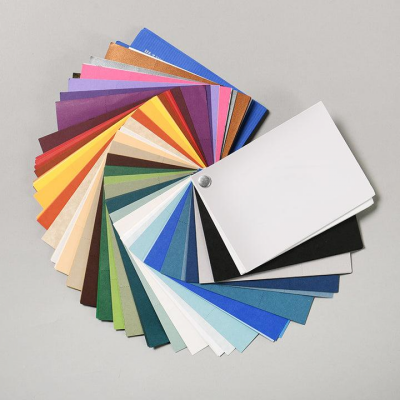
Our color palette has been honed over 20 years, enabling it to match the tone of different jewelry brands accurately. At Annaigee, we focus on fashion frontiers, but we do not simply "pile on trendy colors"—instead, we explore the "temperamental alignment" between colors and jewelry.
Our designers adhere to a precise matching logic of "Color - Style - Jewelry Category". The colors chosen for packaging not only align with consumers’ current demand for "personalization and emotional connection" but also enhance the value and storytelling of jewelry through color language.
As a leader in custom jewelry packaging, Annaigee always clarifies three key points before design:
The category attribute of the jewelry (e.g., engagement rings, affordable luxury jewelry, vintage jewelry);
The target audience (e.g., Gen Z, mature women, male consumers);
The usage scenario (e.g., daily wear, holiday gifts, heirloom collections).
We then select colors from our palette that "enhance jewelry value and convey the emotional needs of the target audience," ultimately making the packaging an "extension of jewelry value" rather than an independent "trend carrier."
Annaigee’s Designer Recommendations: 2026 SS PANTONE Colors for Jewelry Packaging.
Trendy Color Name | PANTONE Code | Core Color Traits | Suitable Jewelry Categories | Recommended Packaging Styles |
Acacia (Golden Wattle Yellow) | 13-0640 TCX | Green-infused yellow, bright vitality | Light jewelry (freshwater pearls, small diamonds) | Natural luxury style, minimalist fresh style |
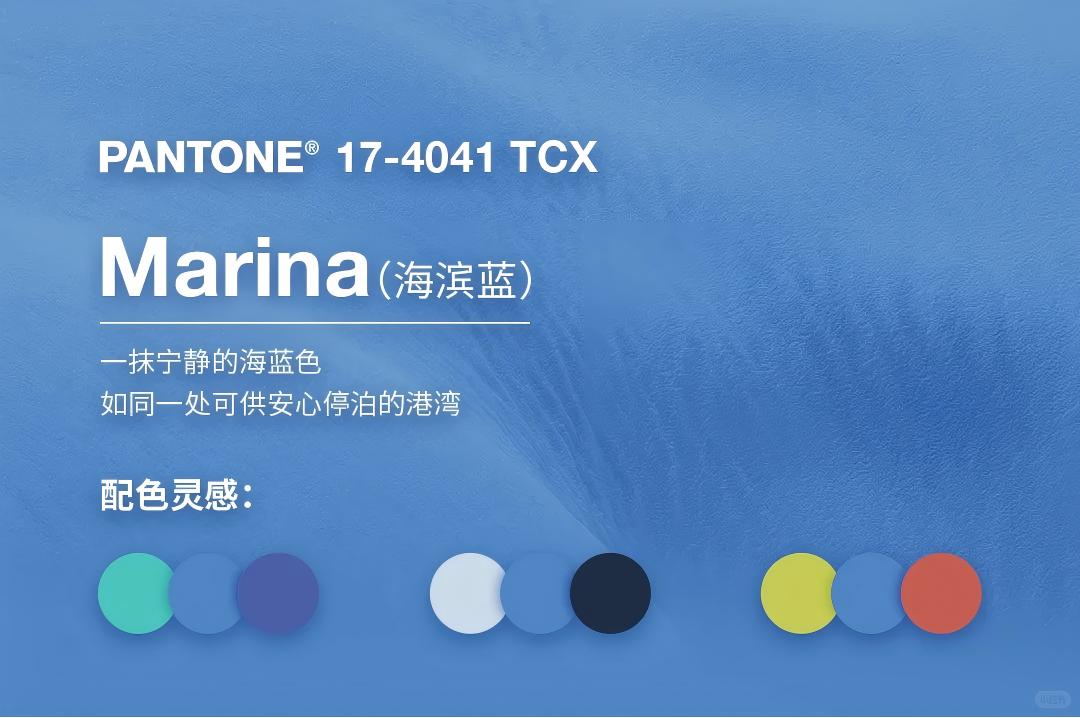
Marina (Ocean Blue) | 17-4041 TCX | Serene ocean tone, soothing | Cool-toned jewelry (sapphires, white diamonds) | Calm engagement ring style, minimalist luxury style |
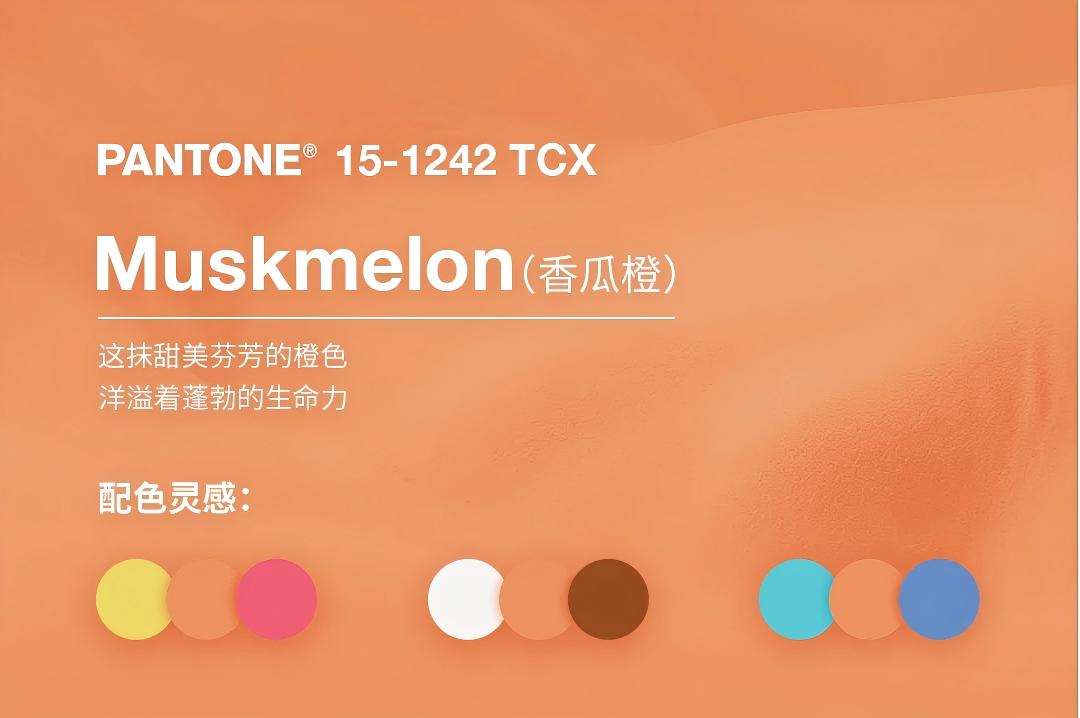
Muskmelon (Cantaloupe Orange) | 15-1242 TCX | Sweet, energetic orange, vibrancy | Youthful jewelry (colored cubic zirconia, silver jewelry) | Playful sweet style, light retro sweet style |
Alexandrite (Chrysoberyl Teal) | 18-4835 TCX | Rich teal, noble elegance | High-end custom jewelry (emeralds, jadeite) | Retro royal style, artistic custom style |
Lava Falls (Lava Red) | 18-1552 TCX | Fiery red, ceremonial feel | Celebration jewelry (rubies, solid gold) | Festive gift style, modern Chinese style |
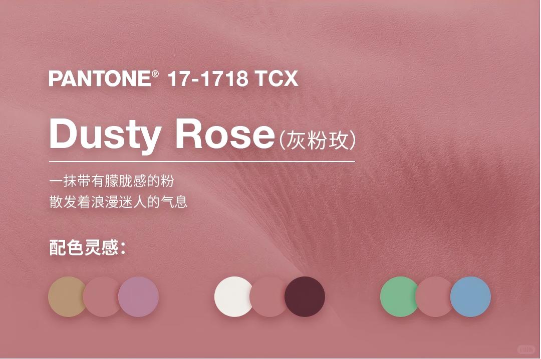
Dusty Rose (Misty Rose Pink) | 17-1718 TCX | Low-saturation pink, gentleness | Soft jewelry (pink diamonds, rose gold) | Romantic pearl style, mature office style |
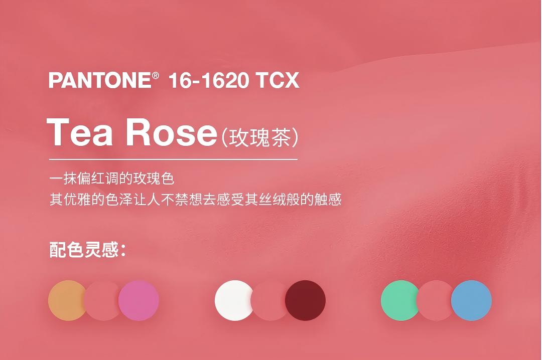
Tea Rose (Tea Rose Red) | 16-1620 TCX | Red-infused rose, elegance | Vintage jewelry (vintage rubies) | Retro velvet style, elegant lady style |
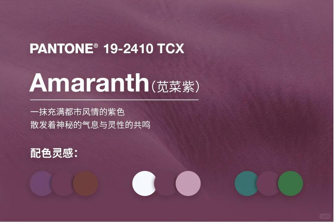
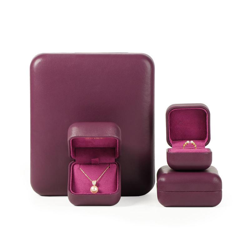
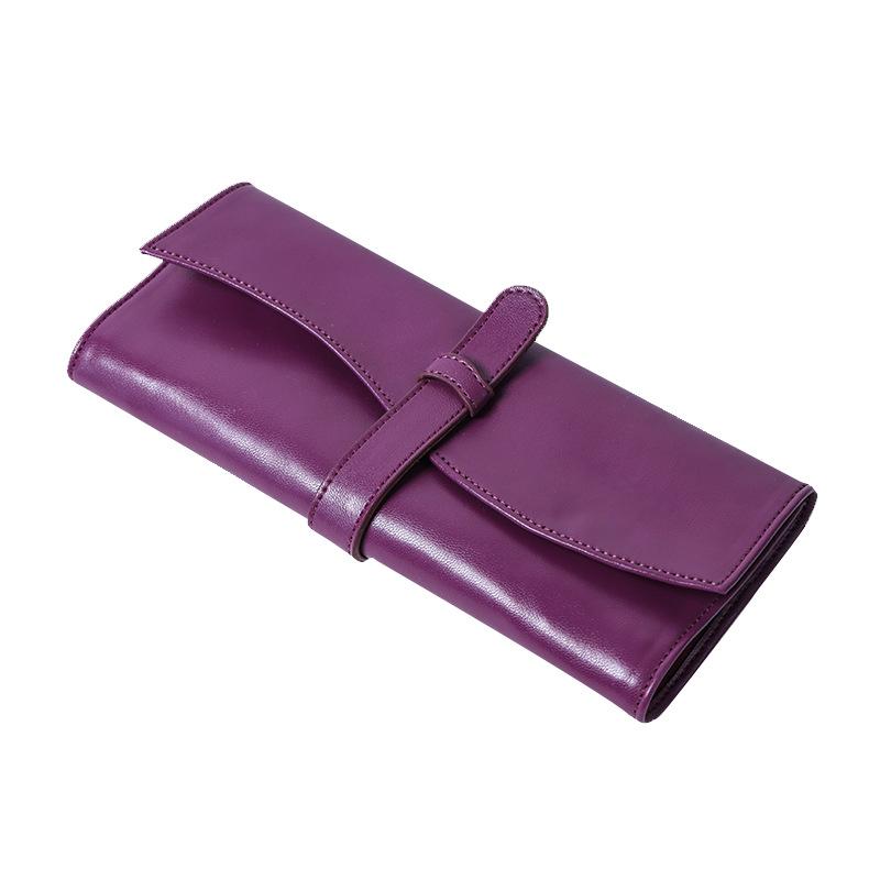
Amaranth (Amaranth Purple) | 19-2410 TCX
| Urban purple, mystery | Streetwear/designer jewelry (amethysts) | Edgy dark style, artistic niche style |
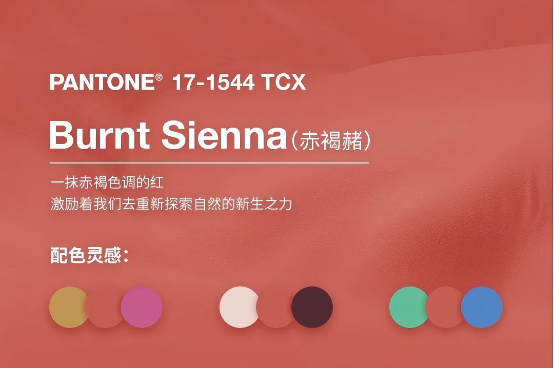
Burnt Sienna (Burnt Sienna Red) | 17-1544 TCX | Reddish-brown, earthy vibe | Nature-inspired jewelry (amber, red agate) | Earthy natural style, intangible cultural heritage craft style |
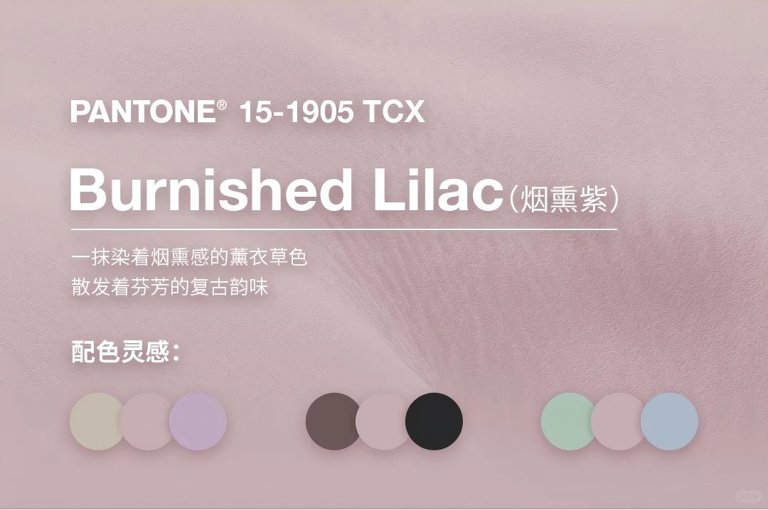
Burnished Lilac (Smoky Lavender) | 15-1905 TCX | Smoky lavender, retro charm | Nostalgic jewelry (Baroque pearls) | Retro pearl style, gentle gift style |
You pour your heart into designing every piece of jewelry; we dedicate ours to polishing your jewelry’s "first impression." At Annaigee, we create "instantly luxurious" custom packaging for your jewelry—so that from the moment customers unpack the box, they are convinced: "This jewelry is worth it."
As consumers’ color awareness grows, they not only expect a rich variety of color options in products and services but also desire these colors to accurately convey their values, lifestyles, and emotional needs.
The annual announcement of PANTONE Color of the Year has far-reaching influence: it not only shapes trend directions in the global design field but also inspires professionals and consumers alike to skillfully integrate these colors into all aspects of daily work and life, showcasing their inner charm in unique ways.
Looking ahead, Annaigee Packaging deeply understands the importance of color in jewelry packaging. In the future, we will work even harder to adhere to the matching logic of "Color - Style - Jewelry Category". The core of combining trendy colors with brand concepts is to make color a "visual carrier of brand values"; through the synergy of "Color + Material + Craftsmanship", we will turn jewelry packaging into a "concrete expression of brand concepts."

Quick links
Products
Contact us
Contact: Veronica Chang
Contact number: +86 15622157335
Email address: veronicazhang@aliyun.com
WhatsApp: + 86 15622157335
Address: No.2, Tangjiao Tenth Street, Lilin Town, Zhongkai High-Tech Zone, Guangdong, China
We are confident to say that our customization service is outsatnding.